the muny (Municipal theatre association of St. louis)
“The Muny has partnered with Core10 for our next phase of capital improvements, which includes a complete reimagining of our backstage support spaces. From the beginning of the project, we’ve been most impressed with Core1O’s attention to our needs through time spent observing our operations and talking with team members. With this insight, they’ve developed a plan which truly reflects our vision for the future.”
PROJECT: The Muny Backstage
LOCATION: St. Louis, MO
SCOPE: 37,o00 sf
Reuse, Renovate, and Adapt
STATUS: Under construction
CLIENT REP: Sean Smith, Director of Operations
DESIGN TEAM: Amanda Partyka Norris
Megan Mitchell
Michael Byrd
Sheila Miranda
THE CHALLENGE:
The Muny is a Broadway-style outdoor musical theatre that seats 11,000 guests. This local opera has produced every show in-house since its opening in 1919. Such an extensive production requires local actors, costume designers, stage managers, an A/V team, painters, builders, ushers, administration, marketing, and a nurse.
Due to this complex mix of workers combined with renovations and additions stitched together over the last one-hundred years, the administrative and shop/actor/support areas at The Muny Backstage required an overhaul.
OUR APPROACH - way beyond the spreadsheet:
From the start of this project, we kept our focus on a design that acknowledges every part of the show-making process for this unique theatre company. The qualitative part of our process became tangibly important. Spreadsheets could not lead us to the best solutions for this space. Instead, we let The Muny team show us what they needed.
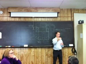
We interviewed every facet of the production teams and staff.
We attended shows both front-of-house and back-of-house.
We sat in on meetings.
And we watched them while they rehearsed, painted, built sets, and designed and stored costumes.
We were excited to see how each function operates, how they got there, and why. Our observations led us to understand the nuances of how materials and talent flow prior to, during, and after a show. And that enabled us to provide them with solutions customized to meet each team’s backstage challenges and opportunities.
OUR SOLUTION - reimagine the current space:
The assumption at the onset was that more space was needed. But our observations led us to recommend reimagining the current space with an emphasis in three areas.
1. Improve adjacencies
· Move all costume programs into the same building
· All patron functions move to public-accessed areas
· Upper floors = administrative team offices
· Bottom floor = actor spaces, kitchen, and gathering space
2. Increase community and connectivity
· Most actor spaces had exterior access points, but no internal access. The new design includes a corridor on the first floor to connect actor spaces, the lounge, and the rehearsal room with year-round access.
3. Improve accessibility and wayfinding
· Establish one clear point of entry for backstage teams and visitors
o Include a new elevator to reach all floors
Washington University - tyson research center
PROJECT: Facilities Master Plan
LOCATION: Eureka, MO
SCOPE: Reuse, Renovate, and Adapt
STATUS: Completed 2013
CLIENT REP: Dr. Kevin Smith - Ph. D/Director
DESIGN TEAM: Tyler Stephens and Michael Byrd
“We were very pleased with how Michael and Tyler dove right into the project and spent a lot of time on-site learning about exactly what we do and what our needs are. In the end, we are very pleased with CORE10’s recommendations and plans, which included a very clever repurposing of some currently unoccupied space.”
THE CHALLENGES:
Over the years the spaces had suffered with failing wood paneling, uneven floors of various materials, a kind-of-gross shower, and an overburdened kitchen.
The LLC could not include a functional kitchen and still meet its net-zero goals, making the deck and gathering space underused.
Our master plan required more administrative and researcher office space. But during our site visits we discovered a new requirement - the 2005 Living Learning Center provided terrific gathering space and a new deck, but the deck was largely unused! The reason lay in the kitchen.
We discovered a failing roof structure that required new trusses over half the building, which expanded the project to a gut rehab.
OUR SOLUTIONS:
We reconfigured the layout of the building to create a more cohesive overall campus.
We designed a new kitchen and moved it to the back of the building where it opens up to a new deck.
The deck creates a private campus at the rear because it connects the LLC to the new warehouse labs and gardens.
In order to create consistency throughout the building, we replaced and evened out the flooring.
We created a new trussed roof with insulation below the deck, and left the trussed space open inside in order to maximize the common areas.


